Connection Manager UI Specification
General Interaction Overview
In spite of the new configuration of Connection Manager 3.0 (CM)--the always-open UI--most of the underlying interaction and code remain the same as the current CM, even as new behaviors have been added. The most important things to keep in mind are:
- We still have modality in the interactions. As in the current CM, since it would be very confusing (and possibly risky) to change the UI state during a repair experience (the Repair Wizard, which will follow the SPRT solution mapping), we will always suspend monitoring of connection components during a repair. The user needs some indication that the monitoring function is suspended or we risk them leaving the UI in a state where no new information is being gathered.
- The old RepairCenter is still available, under the Expert Mode screen. This will allow the user access to most of the SupportActions and tools, regardless of the monitored state. However, during some Expert Mode interactions (as in the current Repair Center) we may need to suspend monitoring in order to avoid errors/confusion.
- The Repair Wizard experience is always user-initiated. That is, we will never change the user's UI without their permission, either by clicking "Yes" on a trigger dialog, clicking on a toast (popup), or double-clicking the system tray icon. This is a cardinal rule of UI design: do not change the UI without the user's permission. This leads to the case of what happens if the user does NOT give permission. In this case, we are proposing a Repair button that will appear as kind of a "bookmark", so the user can enter the Repair Wizard even if they choose to ignore the initial alert.
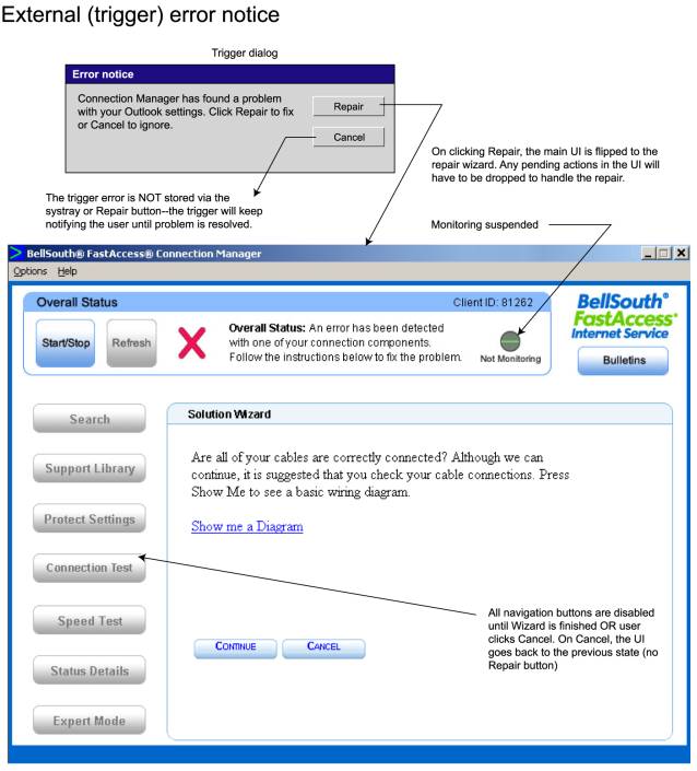
- We now have triggers (alerts for third-party applications). These are fundamentally different from CM connectivity alerts via the toasts and systray icons since CM has no way to monitor and verify when the trigger event/problem has been fixed, except via SPRT code saying it is fixed at the end of a Repair Wizard experience. Triggers will NEVER show the Repair button if the user elects to ignore the trigger dialog (click "Cancel") because CM would never know when to turn the button off (system refreshes would not detect state of third-party app). So for triggers, a cancel will simply dismiss the trigger dialog until the next time the trigger is fired. That is: if the user tries to get their email, and a failure fires the "repair mail" trigger, if the user clicks "Cancel" on the trigger dialog, the trigger will simply go away until they try to get their email again.
The next pages will attempt illustrate the various use cases/interaction flows, highlighting the points above. NOTE: this information is meant to supplement existing storyboards and appendices provided in requirement documents.
Opening
the Repair Wizard
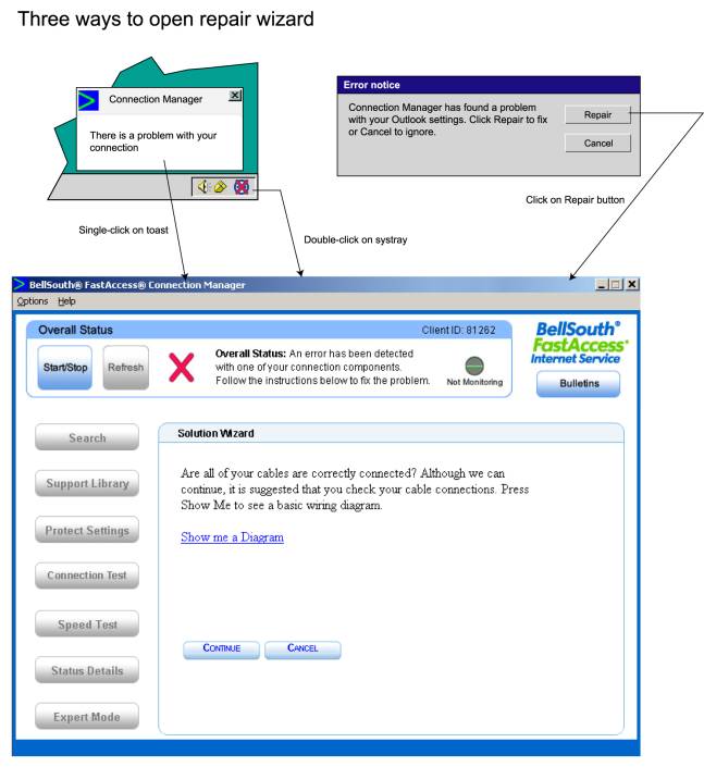
In general way, there are three ways to go directly into the Repair Wizard experience, shown below. Keep in mind the CM UI may be opened or closed (in the systray) and the interaction is still the same. The user gives permission to change their UI by these interactions. Note that the lower pane navigation is disabled and the Not Monitoring icon is shown while in the Repair Wizard.
Application
Trigger Alert behavior
The
diagram below shows how the UI will react to the user interacting with the
trigger dialog. If "Repair" is clicked, the Repair Wizard is opened.
If "Cancel" is clicked, the trigger dialog is simply dismissed and
the main UI keeps whatever it's current state is (All Good, Unknown, etc.). The
trigger will keep appearing (based on the defined trigger event) until the user
chooses to deal with it.
Figure
2
Monitored
error alert (non-trigger) behavior
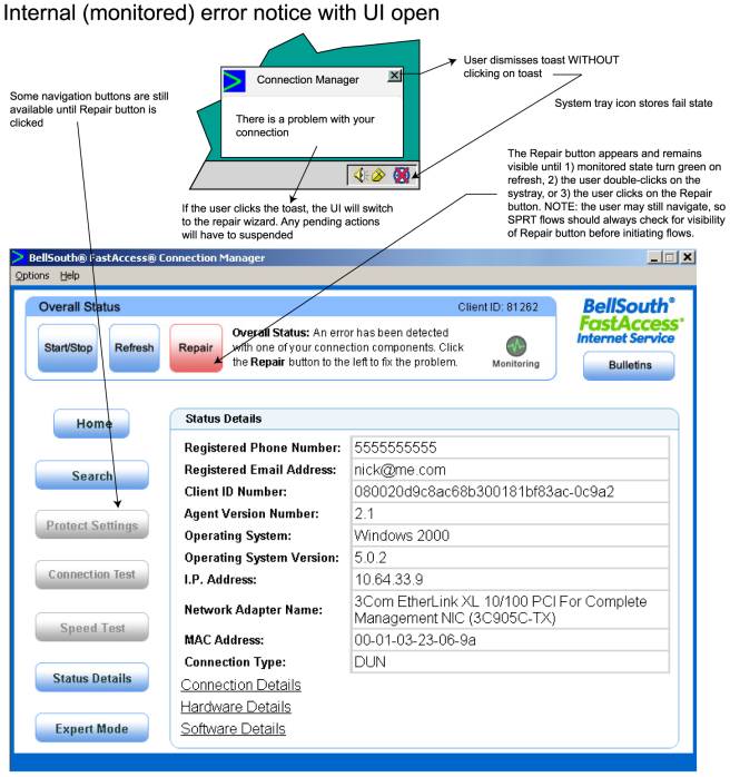
In
this interaction, the user is presented with a toast notice of a monitored
error. If they click on the toast, the UI switches to the Repair Wizard (if
already open) or opens already in the Repair Wizard (see Figure 1). If the user
ignores the toast or clicks the toast close-box, the systray changes to an
error state and the Repair button appears on the UI if the UI is already
open. If the subsequently clicks on the systray icon OR the Repair button,
the main UI transitions to the Repair Wizard UI.
Figure
3
Repair
button and Repair Wizard behavior for monitored (internal) errors
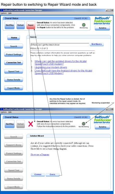
When the main UI is open, the Repair button acts as a
"bookmark" for the repair experience. When the Repair button is
clicked, the Repair Wizard is invoked. If the user clicks "Cancel" in
the wizard, the Repair button re-appears until the error is either fixed or
disappears on a subsequent refresh. Note button and monitor status.
Figure
4
UI
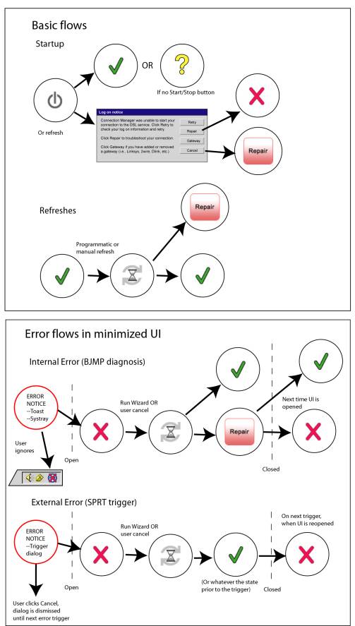
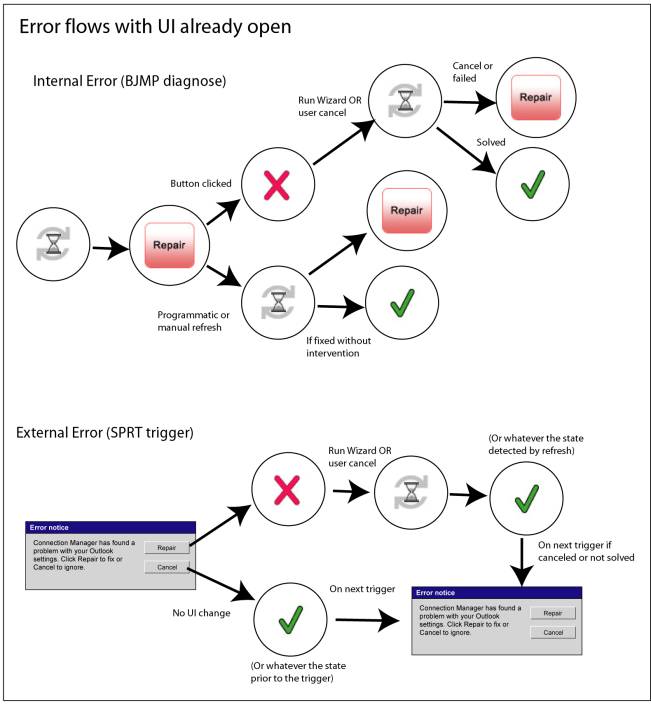
flow schematic
The
following diagrams show a schematic view of how the UI transitions between
various states. Figure 5 defines the state "icons" by showing the
icon (the circled overall icon, representing the overall state) and the actual
state of the UI mapped to that icon. Figures 6 and 7 show the state transitions
via the state icons.
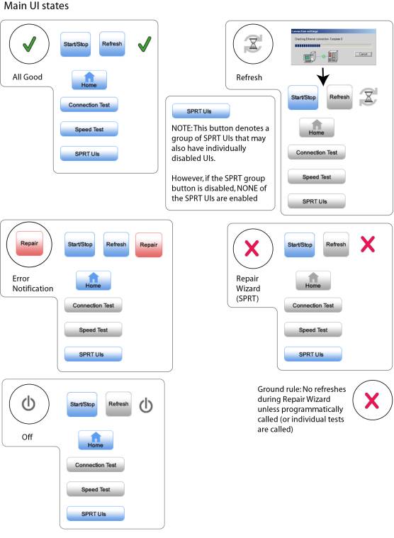
Figure
5
Figure
7
UI
template and configuration guide
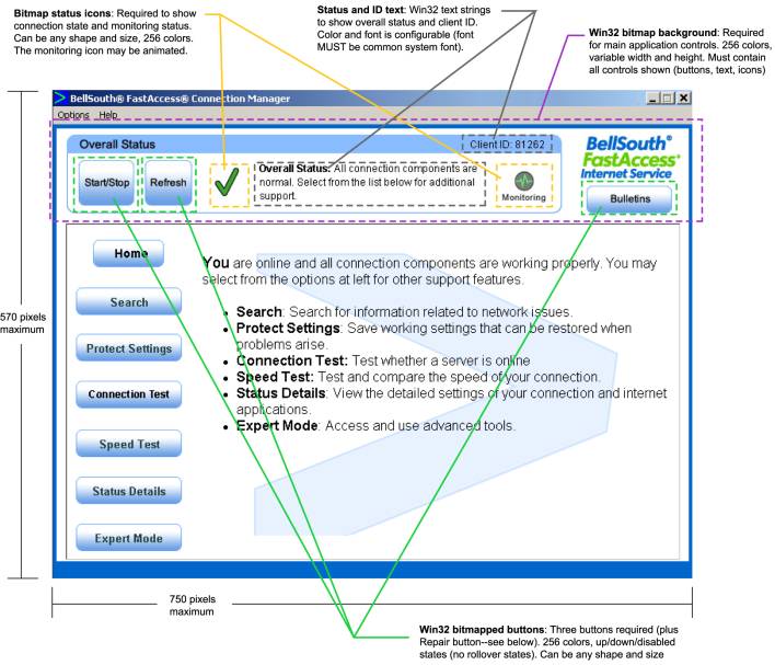
Figure
8 shows the current look&feel of the CM 3.0 UI. It was based on the current
BLS support site, which we understand is being revised. The main points to keep
in mind are:
- The upper portion of the UI is Win32 code. This means that any graphic changes entail re-compiling and re-testing code, possibly impacting schedule.
- The lower portion of the UI is an HTML window (with the exception of the Bulletins), so the content is standard HTML assets. However, this content will be extensive so widespread changes may impact schedule.
- All UI elements are customizable as to shape, color, size, and location. Once positioned however, elements cannot be re-positioned at runtime (no dynamic layout).
- The layout and elements shown are based on a year's worth of usability testing with various customers and is the recommended BJMP configuration. It also reflects the modes and flows shown in the previous pages of this document
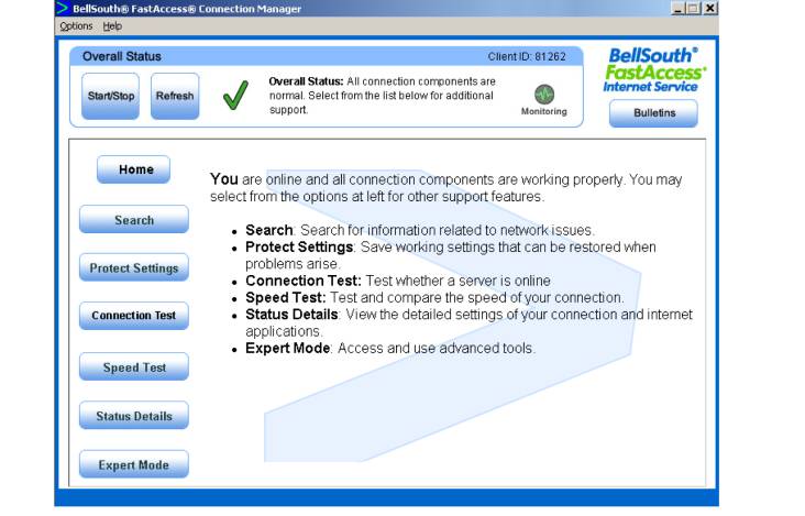
Figure
8
Upper
UI guidelines
Figure
9 shows the main elements and restrictions of the upper Win32 UI. As agreed on
12/18, the client ID will be removed and the "gel" graphic will have
square corners rather than rounded. Additionally, it may not be possible to
show the "Overall Status:" text at the upper middle of the screen in bold.
Figure
9
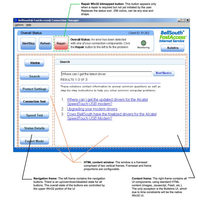
Lower UI guidelines and Repair button location
The Repair button is located in the same spot that the user is trained to look for the overall status icon. This is therefore consistently located and makes dual use of the overall icon space on the UI.
The main restriction on the lower UI is that it is a vertical two-frame frameset.
Figure
10